Having a website is like having the best version of yourself promoting your services or portfolio, 24/7.
Imagine having ideal clients or brands reaching out to you first to do business. With a proper website, you'd be surprised at how many seemingly random opportunities start appearing in your life.
These are 4 reasons every creative should have a personal website:
An age-old debate in personal finance is whether renting or buying is the better option.
While there's no clear "correct" answer in regards to housing, I believe there's a correct answer in regards to your online presence.
When you have an account on a social media platform, you don't own anything. Your handle could get removed, your account could get deleted, you have no information about your followers or subscribers, and the social media company controls the place where you communicate.

With a website, your account could technically be suspended by the website host, but the chances are much less likely and you still have the ability to collect visitor information. This could come in the form of email forms (newsletter, downloads, etc), contact forms, selling a product, or joining a community. By getting this information, you can then contact someone without needing to rely on social media.
Your website also acts as a home for everything you do.
It's difficult to display your work on one social media account, but a website is flexible and can house different types of media and formats.
Right now, the key is use both rented and owned land to grow your online presence.
Neglecting rented land will likely lead to slower growth, while neglecting owned land will lead to a fragile audience foundation.
Also read: 2 Reasons You Need to Own Your Audience (and How)
As a creative, you take pride in your work. It can be frustrating to deal with the limitations of social media and a website gives you ultimate creative control.
Instead of using a third-party community service like Patreon—which has limited customization—you can create a unique experience for your following using tools like Webflow Memberships, Outseta, or Fourthwall.
One of the best examples I've seen is Cody & Noel's TMG Studios site where fans can subscribe to podcasts, read comics, and enter the members-only room:

For those who provide a service, instead of using a third-party tool like Linktree or Dribbble to exclusively host your work, add a simple website to the mix so that you can take advantage of SEO and custom design.
You'd be surprised at how easy it is to create a website nowadays and tools like Carrd offer <$50/year plans.
When you're doing business online, there are a lot of different ways for someone to get a first impression of you. They could see a random video, blog post, or comment and no matter what, it'll influence how they initially feel about you.
With a website, you can tell your story and give someone more background and context about who you are and what you do.
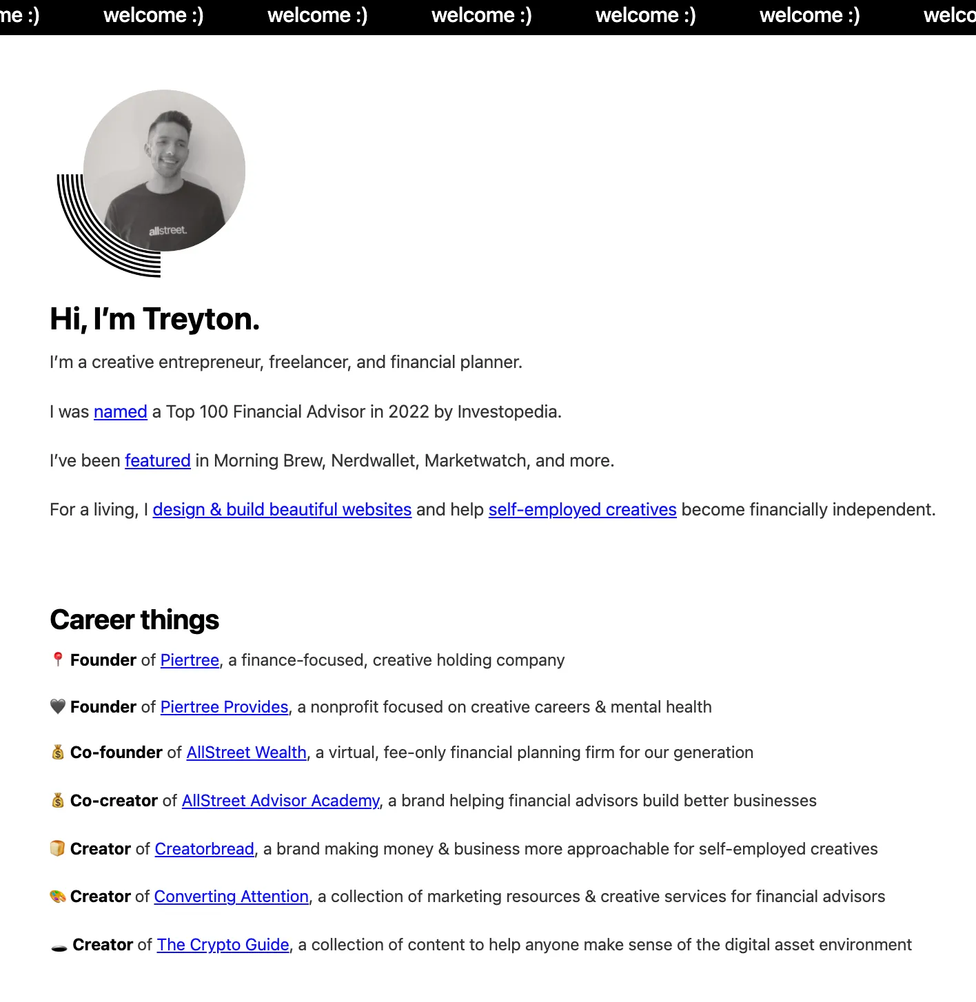
For example, I include a quick bio and link to my entrepreneurial story if someone wants to learn more:


Investing in a personal website also shows you're serious about your work and for some people, that's all it takes to convince them to reach out. And there's something special about having a website that matches your name.
I like being able to tell someone to check out treytondevore.com for more info.
For all the John Smiths out there, sorry - you'll have to be more creative with your domain name.
Bonus: If you own your domain you can also get a professional email, such as treyton@treytondevore.com.
If you hate selling, this is the biggest benefit of having a personal website.
As we've touched on, you have full creative control over your website and one of the most effective ways to use it is as a sales funnel.
If you do freelance work, here's how you could use your portfolio to get more inbound clients:
It sounds simple, but I use this exact set up and it's worked extremely well so far. In my first year of doing freelance web design & development, I've built 15 websites and all have came through inbound inquiries.
Even if you're not trying to get clients, I still think there's value in housing all of your creative work in one place.
If you're a musician, you could embed your Spotify or Apple music profiles on your site, add donation or "support" buttons, share stories about different songs, document your journey, create a store, give fans a way to contact you without social media - there are unlimited ways to use a website.
By having one place where you continuously send people you can get more traction, build a stronger brand, and have a better understanding of your growth because you can use tools like Google Analytics to track visitors.
If you're not a designer, keep it simple, stick with one or two colors, and focus on the actual content of the website itself.
For example, Josh Spector's website isn't flashy but it serves the exact purpose that it needs to:

Whether it be subscribing to your newsletter, scheduling a call, or buying a print, there should be (at least) one main action that someone can take. The call-to-action should also be obvious, which is typically done by using a bright-colored button.
When you share your site on social or via text, the image that shows up is called the "open graph image"

Each website builder is different, but you want to customize this so that it's not a blank grey image:

Create a simple, affordable website that can be the home for all of your creative work.
By doing so, you can build a stronger brand, get more inbound inquiries, and come across as more committed to your craft.
